Monday 2 May 2016

My final selection of photographs

Choosing my final six images was a real challenge because I had taken some photographs which I felt I favoured in very personal ways. But I had to make sure that the ones I put forward in my essay were most appropriate and effective in communicating the narrative, comments and comparisons I was trying to make overall. I generally believe that the selection I have made is effective and successful in engaging my audience and communicating a real sense of the kind of impact technology has on our lives. 

Working on this project has definitely helped to develop a sharp eye when it comes to decoding and really finding a message and photographer-audience relationship in images. I have also become much more confident in my story telling through my photography 
 IMAGE 1:
This image was my starting point, it is perfectly expectable for any member of society to be using their phones in their bedroom when alone. This image is a perfect starting point for my essay to begin with, it allows for development throughout and acts to really set the scene. The soft lighting in this photograph gives a really familiar mood and I have roughly composed this image using the rule of thirds. The medium aperture and depth of field brings attention to my subject- Mollie, but also adds a sense of punctum as we catch an additional feel of identity through the elements surrounding her.

IMAGE 2:
The second photograph is key in starting to develop the narrative/story telling element to this essay. The concept of technology is a repeating element. Again I have used the rule of thirds and also the golden rule to compose this image, keeping consistent with the previous image. The lighting is still soft, portraying a comfortable environment along with other elements such as the fact Mollie is wearing a dressing gown. The subject has not broken the fourth wall, which gives the photo an observatory feel.   

IMAGE 3:
Again the soft lighting reflects an inside setting. Another daily task is presented whilst still on her phone. The phone becoming a consistent element in the photos. The rule of thirds and the golden rule are still in use. I really like how she is in focus but her finger isn't which really helps to depict her concentration on her phone and how engrossed she is. 


 IMAGE 4:
Despite this photo breaking the consistent lighting throughout so far, I think it helps to highlight a development, Mollie is now using two devices at once, whilst eating. All these elements fit really nicely into the rule of thirds and the golden rule in this photograph. Consistency can be found in her lack of emotion facially. I also really like how she is captured eating in her room.

IMAGE 5:
I chose this image because I really liked the use of reflection, the focus being on the 'real' verson of Mollie who is focused on her phone whilst getting ready  to go out, she seems not interested in self image at all because technology comes first. Soft lighting continues along with the blue/white glow of the phone outlining Mollie's face in an unnatural way.
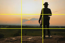
IMAGE 6: 
This photograph is most significant, it gives us comparison. Finally we are taken outdoors into a new environment. All composition rules still applied. Still not in the moment, still on the phone. This photograph is crucial in completing the narrative. The change from artificial lighting to natural lighting plays a key part in this. Consistency in these photographs can also be found in colours used; pink being a main theme, giving rise to representation of young females in our society and the impacts of social connectivity through technology. 


Shoot 6

I also wanted to show some outdoor contrast, and felt that the outdoor atmosphere posed an even deeper thought into the concept of being lost from and not living in 'the moment'. 
 I try to keep consistency with previous shoots by aiming to use the rule of thirds and a rough idea of the golden rule in these images. This helps to keep Mollie's phone centre stage!

 I like how the lighting will contrast in comparison to the rest of my photographs which I will use in the essay, its natural qualities against the yellow tone of the artificial lighting again showing the differences between digital reality and nature.
I really liked how this photo came out  because it is focused nicely and it is different to the rest because she is actually looking up- I wonder what caught her attention. But since she wasn't engrossed in her phone use it doesn't fit with the main focal point of the project

Shoot 5

In another shoot, I photographed Mollie completing normal tasks half heartedly whilst on her phone, the aim was to compare the impact of technology on our everyday lives in simple daily tasks such as cooking and brushing our teeth.
 In my composition I have considered the golden rule and the rule of thirds carefully, to try and capture the attention of my viewers on the most important elements of the photograph.


 I think these photos are effective in demonstrating the invasion of tech in the lives of people, young adults in particular who have grown up indulged in connection and satisfaction from online interactions.


I made sure that the synthetic lighting in these photographs wasn't too bright because I didn't want to take away from the light of the phone, lighting up parts of Mollie's face. I really like the way this shows up in some photos more than others in particular.

Shoot 4

I asked my subject, if I could photograph her whilst she was eating dinner. She asked what room and I told her I had no preference and that she should just eat whereever she usually does. Interesting that it turned out to be in her bedroom. She has turned out to be a great multi-tasker- watching gossip girl, eating and social 'media-ing'.
 I experimented through these images, trying to roughly use the rule of thirds to capture the three key elements; the human, the technology and the day to day task being interrupted/sculpted by the technology (in this case eating dinner).
 I used a medium shutter speed to shoot these photos as there was no fast movements being captured. I used a medium aperture as well to try and keep detail from the background but also giving some focus to the key elements of the photograph.
 As sad as it sounds I think these pictures perfectly capture the loss of enjoying the moment. She was constantly trying to focus on all these different things instead of just enjoying her pizza. This communicates really well through these photographs.

I have chosen to capture her from a slightly heightened angle to highlight the negative and shocking message which I am trying to convey with these photos. The subject is lost amongst her technology. I am trying to show her in a vulnerable light which I feel the angles I chose to shoot from were appropriate and effective.

Black and white


Without taking away from the key message at the forefront of my project, I'm trying to experiment with simple ways to enhance the structure and content of my photographic essay. So I've experimented with a few forms of black and white using photoshop. 
I really like this outcome, it sits simply with the theme, and contrasts against the whole idea of technological advancement and brings us back to a more simple form of photography. On the other hand I am concerned that with this change in editing we lose attention to some details which are crucial in to be recognised with the points I am trying to explore and communicate clearly. I don't think I will end up using any black and white editing in my work as it takes away from the highlight and attention to the aspects of technology in the image.


Visual plan


Sunday 1 May 2016

Using reflections in photographs

I am looking into using reflections and mirrors possibly for my project to add punctum element to it. So I have look in more depth at how photographer have used this in the past to help decide whether this is something I want to pursue in my photographs.

In particular I looked more closely at an artist called Toni Frissel who has previously worked with reflection.
The composition of this photograph is lovely to the eye, using the rule of thirds. The use of reflection in this image, makes a strong addition to composition, filling a third of the image, adding to the contrast between dark and light in this black and white photograph.

Ways of seeing Berger

This reading taught me how interpretation varies constantly, it is based on a relationship between artist and audience. There can be many ways and reasons that 'seeing' an image differentiates between people.
Berger talks about the importance of recognition and the meaning behind this. We see what we choose to look at. Photographers present these sights, they choose how and when they do this. The photographer's way of seeing will almost definitely be different from how the viewer sees.


COMPOSITION RULES

The golden rule (or ratio)
This rule is hard to explain but is a greek symbol. This rule demonstrates to us how the eye follows a pattern. By using this rule you attract the eye of your audience in a way that seems very natural to the eye. The concept works with the idea that you place your subject or object within this as a grid.
Dynamic symmetry: this uses diagonals to organise the point of interest, instead of the standard gride, where the two diagonal lines meet is where the point of visual interest will be. 


The Rule of Thirds

This rule of composition follows the simple standard grid, and describes how the point of visual interest lies where the lines fall when the frame is divided into three column. This is a very common rule of composition, which is often provided, built into many digital cameras.


Application: Examples of differences between Landscape and portrait in my vernacular photography


Photography composition, Basic, Space and Application

Photography composition can hold different rules for different areas of photography for example the rules that apply to landscape photography will not apply to portrait photography.

In landscape photography lighting, and moment play a key role as certain factors are extraneous such as the weather. Lighting will be different at different times such as the hour which is the softer natural lighting after sunrise and before sunset.

Portrait photography is different to this, I am much more interested in portrait photography than landscape photography. There is something I think people find captivating about portrait photographs- something appealing about the human form and being able to relate to these photos on outset.  Portrait photography in an arranged setting such as a studio will be composed to a portrait image that was taken of a stranger in an outdoor location. These are factors to consider when taking pictures.


Disposable cameras


I decided to experiment with the kind of images disposable cameras take and using light to produce these images. This photo was of a full bike rack near a train station in London at night but the flash only half went off so, the image came out like this, with a massive streak across it and the bikes only recognisable by the light reflectors on their wheels. Despite not really capturing anything fully visible I like the colours which have come out and the light in sections, it almost fits the criteria for the golden rule.

Photo editing

I have made a conscious decision to not purposely edit my photos unless it is necessary to retain consistency in light composition throughout because, I think the photos being 'raw' and untouched further by technology keeps them real and personally I feel theres something much more authentic about photographs without filters and saturation being played around with. I want to keep all the elements in my images as close to reality as possible without using analog photography.

I might experiment with my photographs on Photoshop to see if I can better them in any way, but I plan on keeping them untouched in this sense

Idea changes

In my original idea there was much less of a focal point, where I had loosely based my idea around portraits and close ups of personal possessions. My idea had no real direction or message to communicate with my audience about identity.


But once I sat down and brainstormed some real elements which I was passionate about and felt fit the brief I decided that I wanted to continue with the focus on portraits but to explore the mentally of today's "lost" youth and the role of technology in our lives. Being part of this Generation Z growing issue, I feel very strongly about using the captured image to show my audience the effects on day to day life.


Inspirational images: Urban photography and punctum

After looking into the concept of punctum in class sessions, I took an interest into urban photographers. A photographer who caught my eye in particular was Nicholas Goodden, whos work was very captivating and held a lot of meaning at the same time.


Goodden's work is very clever in its composition and use of aperture in its use of depth of field. For instance in this first photograph we see a female subject but she is blurred and unfocused, theres a narrow depth of field which means that as viewers we are captivated by the poster of Pharell Williams on the tube station wall. We are able to infer from this photograph that she is on the underground from the depth of field revealing the tiled platform wall behind her- this places her in central London.

 I really admire the composition of this photograph also, the elderly couple placed in the centre with other little details shining through like the overgrown patio and tattered lace curtains which is suggestive that they are living in a council terrace red bricked house in London.
I love the use of reflection in this photograph where we can see that the subject is sitting in a shop outlooking on a high street and the glass also draws attention to the bookcase in the back. Or the focus pull on the facial expression of the subject.

Nicholas Goodden's photography blog:
http://www.nicholasgooddenphotography.co.uk/best-london-photography

Databending


Following a class session where we learned about how to converting picture files into audio files and then playing with features such reversing and paste and then turning it back into a picture file.
I really like how this has turned out, visually. The colours that have come out work really well together.

Imaginary landscapes


Following the presentation on cultural imaginaries and landscape photography. I played around with images on photoshop to create my own imaginary landscapes. I chose to play with a contrast of a natural landscape with mountains, water and greenery against a landscape photo of inner city with sky-scraping buildings.

My editing skills are not as strong as I had hoped but the message of the piece still stands which has political ties. In this piece I am trying to express the rise of capitalism all around us and the loss of care for the environment in developed and developing countries. I replaced the mountains in this landscape with an image of city tower buildings.

Punctum

Punctum within photography is something extra which engages the audience, maybe an external detail or an object. These tend to make the photograph more interesting to the audience and catches the attention of these viewers. It might give further insight into the message of the photo or 


For example in this image taken by Arbus. The initial attention grabber is the child in general, looking at his facial expression and elements of his clothing. But then we are drawn in by the grenade held in his hand. This gives the photograph another element of interest to the audience. It can give the chance of alternative readings.


Saturday 30 April 2016

Title

Think of a title for my piece was a challenge. I really wanted to sum up my photographic essay in a clever compact. Whilst discussing Dijck's 'culture of connectivity' in class we were talking about the technical name for this generation which is 'Generation Z' we talked about how it could be said to stand for Zombie- I might play with this concept in my title. 

Individual photographs will probably be more intricate in relation to the factors which change across the essay. I would like to incorporate some kind of social media related jargon and play with the concept of constantly waiting for '.... liked your profile picture' '.....shared your post' '....added you as a friend' etc   

Friday 29 April 2016

Circulation and authorship of the image

Who owns the authorship of an image?
Some artists use the work of others to create their own for example (agdhf) and her use of flickr images to create a larger image. So who is actually the 'author' of said image??
Is this ethical? For some artists to take credit for other artists work? Interesting the learn that it should be considered acceptable for an artist to use the work of others if they use it in a different and new way, making it something different and new - making the seond artist in the process the author because they are the creator of the new work.
Interesting to know I could incorporate the work of another into my own. 

Thursday 28 April 2016

Cultural, imaginaries and landscapes

Editing landscape photography has produced some very visually pleasing and interesting outcomes. This kind of manipulation can make comments and communicate messages with the audience of the photographs. It might represent a different side to the same reality. These products can be very powerful in their symbolism and narrative. The concept of cultural imaginaries combined alongside landscape photography is a very interesting topic. It is unlikely that I will look further into this though as my main interest lies in portrait photography but this idea is appealing.


Analog to digital: Indexical Function of photographic images

analog photography has often been referred to as a reflection of reality because it uses the natural bouncing of light into the camera. In contrast digital technology uses coding to create image.

The reading talks and questions whether an image existing in a digital newspaper is less reliable or 'real' than one printed in a physical newspaper. This is a concept I find interesting. Is an image less real if it only exists in digital form?

Does the ability to enhance and manipulate digital image make it less real. This is one reason why some consider analog photography to be a better representation of real life. But in my opinion it is down to personal experience and presentation which reflects in image- digital or analog. Every version of reality is someones 'real' experience.


I don't think that whether a picture was created using analog or digital photography can determine whether a photo is real or not.


Project development

Thinking in depth about the composition of my photographs, I have planned certain aspect which I will intend to make consistent through my photographic essay.


Coloured image:
 Initially I considered making all my photographs black and white, to draw the attention of my audience to the most important element of the photographs, the person and the technology. But I feel that coloured image would be more appropriate in helping me to depict to my viewers aspect such as historical context, social context and to present environmental and situational components such as what the subject is doing? where is she?


Framing:
I want my framing to be consistent throughout my photographic essay, I did want to experiment with close up shots but I think it will be a lot more effective and have much more appeal as a narrative essay if all the shots are consistent in how they capture the subject, from the same slight high angle and a mid shot showing the subject and her surroundings without being a long shot. I want to use the surroundings as the punctum element of my work, making the photos interesting to the audience.

Composition:
I want to compose my photos in a way that it can be seen that my subject is aware of the photographs being taken but there is no direct address made between the subject and the viewer. I do not intend to break the fourth wall in my work


Thinking photography - Burgin

Does photography impose a point of view?
Photography has a way of showing us elements of the photographer. Portraying messages through their eyes, through their viewpoints, often presenting a very specific point - allowing audience to see this in the same way as the photographer did/does. Framing and composition of image plays a huge part in this.
Burgin makes it clear how important ideologies are, so that they can be reinforced or subverted by the photographer. Therefore making social, political, economical etc statements through image. The same concept might be captured and presented by different photographers in different ways therefore showcasing different viewpoints the same subject at the same point in time could be captured from conflicting viewpoints and this may result in influencing the audience in different ways.  
This reading was very helpful in highlighting the power of the photograph and how it represents the photographer and his or her viewpoints in many ways. It is interesting because it takes a set of coding to create an image but it must also be decoded by the audience on the other end. This is something I will consider when composing my images what kind of stance I am taking towards ideologies set and how I am constructing a view point.

Technology, youth and photography research

Whilst researching the concept of youth and technology to gain more insight into my theme, I came across a project which is similar to mine in many ways.

Sebastian Kainey from Australia created a photographic project which also explores modern technologies ability to isolate western youths and develop a strong dependency on electrics and social networking.